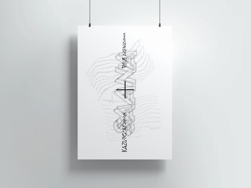
SANAA
This project included the creation of two posters, denotative and connotative, in order to showcase the style of work through the use of typography and layout, to communicate ideas and meaning.
Role
Communication Designer,
Art Direction
Tools
Illustrator, InDesign
Timeline
September 2020 - October 2020
Project Overview
SANAA is a Japanese Architecture firm, founded in 1995 by award-winning architects Kazuyo Sejima and Ryue Nishizawa. SANAA has built a reputation for designing innovative buildings in Japan and all over the world. This Tokyo-based studio is known and admired for their clean and minimalistic elegant style buildings and for their refined simplicity, spatial fluidity, and thoughtful integration into their surroundings.
After thorough research of SANAA and their work, a set of typographic posters were designed to present the information denotatively and connotatively, relying solely on the typographic letterforms and layout.


Denotative
Through this design, the focus is on the structure and grid layout of the type. The main focus with this design is to present the information to the reader clearly, without any additional or hidden meaning.
Connotative
Through this design, the organic, natural, and fluid style of the buildings is showcased through the curved lines of text, that work around the title of the poster, just as the buildings are built around the pre-existing surroundings.
Ideation Process
Before reaching the final design of the poster, various concepts, ideas, variations, design decisions, and refinements were made. This included experimenting with grid structure, typographic layout, font selection and expressive typography.


Reflection and Project Takeaways
Reflecting back on this project, I learned the importance of layout and typography on the message being communicated to the audience. As the challenge was to design without using colour, structure and typeface use was the focal point.
A few of the things I learned from this project were:
-
The process of developing grid systems, and the importance of structure in a text-based design.
-
Designing at a large-scale while maintaining readability of the text for all audiences.
-
The importance of always keeping in mind the message that you want to communicate and doing frequent check-ins to ensure that the design is communicating the message clearly.
Looking back to this design, if I were to do this project again I would experiment more with the layout, and experiment with developing different grids, both modular and custom designed, to see how they would change the message that is being communicated.


